I really loved this article this morning on the Beeb:
http://www.bbc.com/culture/story/20141014-gaudi-unfinished-business
I've studied the Sagrada Familia for years. My first impression may have been similar to yours - one of wonder and revulsion. Gaudi was not known for his adherence to convention in a day when convention was going strong. He was working in the late 1800s, when the world was still firmly entrenched in the neoclassical period. There was a huge lean toward ancient Greek and Roman forms, seeking to imbue a sense or rationality, proportion, and stateliness to the world. This is the period where most of the state capitol buildings were designed/built throughout the United States.

Gaudi, whose work was infinitely more organic, pushed the boundaries of what was. So firmly entrenched in the structure of religion and society, his ideas were revolutionary and inspirational. Which, really, is what you want in a building that is to celebrate the greatness of the Almighty and the community which gave it rise. Because ultimately this is what this building is to do - provide a place for worshiping God, first of all, but also to provide a place for community. These buildings become icons of religious faith and devotion and celebrate the aims and highest beliefs of the communities who build them.
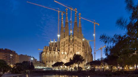
What is difficult to understand from the pictures is two-fold: the incredible detailing at one end of the scale, and the impressive massing on the other. So often, and particularly in our post-modern sensibilities, we prefer buildings that are devoid of color and detail, choosing decoration and details that tend toward the muted and inconspicuous (read: inoffensive). I think that has its place - I rather enjoy quiet, meditative spaces that are free from extraneous decoration and distraction. I would mostly ascribe that to my upbringing, though - I've been influenced by the culture in which I was raised, and in the time frame in which I've been taught these things. The detailing on this building is absolutely stunning. There is not a single square inch of surface area that has not been utilized, from the floor to the tops of the spires. The effect on a macro scale can be overwhelming, and it can be offensive/overwhelming to our sensibilities and senses. I would suggest, rather, that the decoration be considered on a one-by-one basis, rather than evaluated for overall effect.
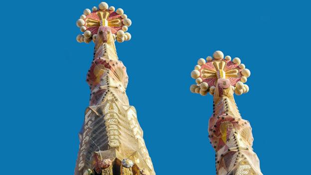
Having said that, the other end of the scale can be very impressive as well. Again, consider the times when this was constructed - things were angular, rationally-based, and classically inspired. In religious architecture in particular, there was (is?) a persistent reluctance to experiment in new and dramatic variances to the norm. How would one know something was a church if it doesn't LOOK like a church? Gaudi, in understanding the forms of (particularly European) religious houses of worship, took those forms and stretched them, warped them, and mutilated them to create something fascinating. You can see the west work (the narthex) with its spires and towers. But rather than the three-bay system that was traditional, Gaudi gives us five - four towers/spires rather than the traditional two. The nave is regulated by the columns, but they are not the static, massive things that we see throughout the rest of Europe. Now, surely many of these changes are due to changes in technology and the availability of and access to skilled workers and materials. But also and again, remember that this was the same period when these same technologies and materials were being used across the United States to construct state capitols which were very, very traditional.
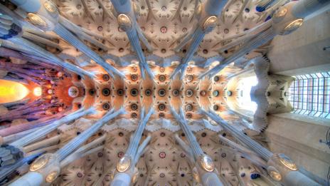
This may be my favorite image. I can imagine laying on my back here in this nave, looking up into this veritable forest of columns and supports. Look how beautiful this is, how very much it raises one's spirit to God Himself. Look how the colors in the east apse highlight and center the focus of the observer, not in a way that is egregious, but subtly and yet demanding... Purple for royalty, red for passion, gold for light... There is real craft and intent here, and the cumulative effect is simply gorgeous.

You don't have to like it. I'm still not sure how I feel about it entirely, either. But as I've studied it, I have come to appreciate and respect the intent and the craft.
Wouldn't you like to come here and lay down under the crossing with me and just stare at this?!? How epic would that be?!?
PS - Check out the medallions - Matthew, Mark, Luke, and John - one for each of the four Gospels...
http://www.bbc.com/culture/story/20141014-gaudi-unfinished-business
I've studied the Sagrada Familia for years. My first impression may have been similar to yours - one of wonder and revulsion. Gaudi was not known for his adherence to convention in a day when convention was going strong. He was working in the late 1800s, when the world was still firmly entrenched in the neoclassical period. There was a huge lean toward ancient Greek and Roman forms, seeking to imbue a sense or rationality, proportion, and stateliness to the world. This is the period where most of the state capitol buildings were designed/built throughout the United States.

Gaudi, whose work was infinitely more organic, pushed the boundaries of what was. So firmly entrenched in the structure of religion and society, his ideas were revolutionary and inspirational. Which, really, is what you want in a building that is to celebrate the greatness of the Almighty and the community which gave it rise. Because ultimately this is what this building is to do - provide a place for worshiping God, first of all, but also to provide a place for community. These buildings become icons of religious faith and devotion and celebrate the aims and highest beliefs of the communities who build them.

What is difficult to understand from the pictures is two-fold: the incredible detailing at one end of the scale, and the impressive massing on the other. So often, and particularly in our post-modern sensibilities, we prefer buildings that are devoid of color and detail, choosing decoration and details that tend toward the muted and inconspicuous (read: inoffensive). I think that has its place - I rather enjoy quiet, meditative spaces that are free from extraneous decoration and distraction. I would mostly ascribe that to my upbringing, though - I've been influenced by the culture in which I was raised, and in the time frame in which I've been taught these things. The detailing on this building is absolutely stunning. There is not a single square inch of surface area that has not been utilized, from the floor to the tops of the spires. The effect on a macro scale can be overwhelming, and it can be offensive/overwhelming to our sensibilities and senses. I would suggest, rather, that the decoration be considered on a one-by-one basis, rather than evaluated for overall effect.

Having said that, the other end of the scale can be very impressive as well. Again, consider the times when this was constructed - things were angular, rationally-based, and classically inspired. In religious architecture in particular, there was (is?) a persistent reluctance to experiment in new and dramatic variances to the norm. How would one know something was a church if it doesn't LOOK like a church? Gaudi, in understanding the forms of (particularly European) religious houses of worship, took those forms and stretched them, warped them, and mutilated them to create something fascinating. You can see the west work (the narthex) with its spires and towers. But rather than the three-bay system that was traditional, Gaudi gives us five - four towers/spires rather than the traditional two. The nave is regulated by the columns, but they are not the static, massive things that we see throughout the rest of Europe. Now, surely many of these changes are due to changes in technology and the availability of and access to skilled workers and materials. But also and again, remember that this was the same period when these same technologies and materials were being used across the United States to construct state capitols which were very, very traditional.

This may be my favorite image. I can imagine laying on my back here in this nave, looking up into this veritable forest of columns and supports. Look how beautiful this is, how very much it raises one's spirit to God Himself. Look how the colors in the east apse highlight and center the focus of the observer, not in a way that is egregious, but subtly and yet demanding... Purple for royalty, red for passion, gold for light... There is real craft and intent here, and the cumulative effect is simply gorgeous.

You don't have to like it. I'm still not sure how I feel about it entirely, either. But as I've studied it, I have come to appreciate and respect the intent and the craft.
Wouldn't you like to come here and lay down under the crossing with me and just stare at this?!? How epic would that be?!?
PS - Check out the medallions - Matthew, Mark, Luke, and John - one for each of the four Gospels...
Comments